Text on a watch dial has to communicate without competing with the time.
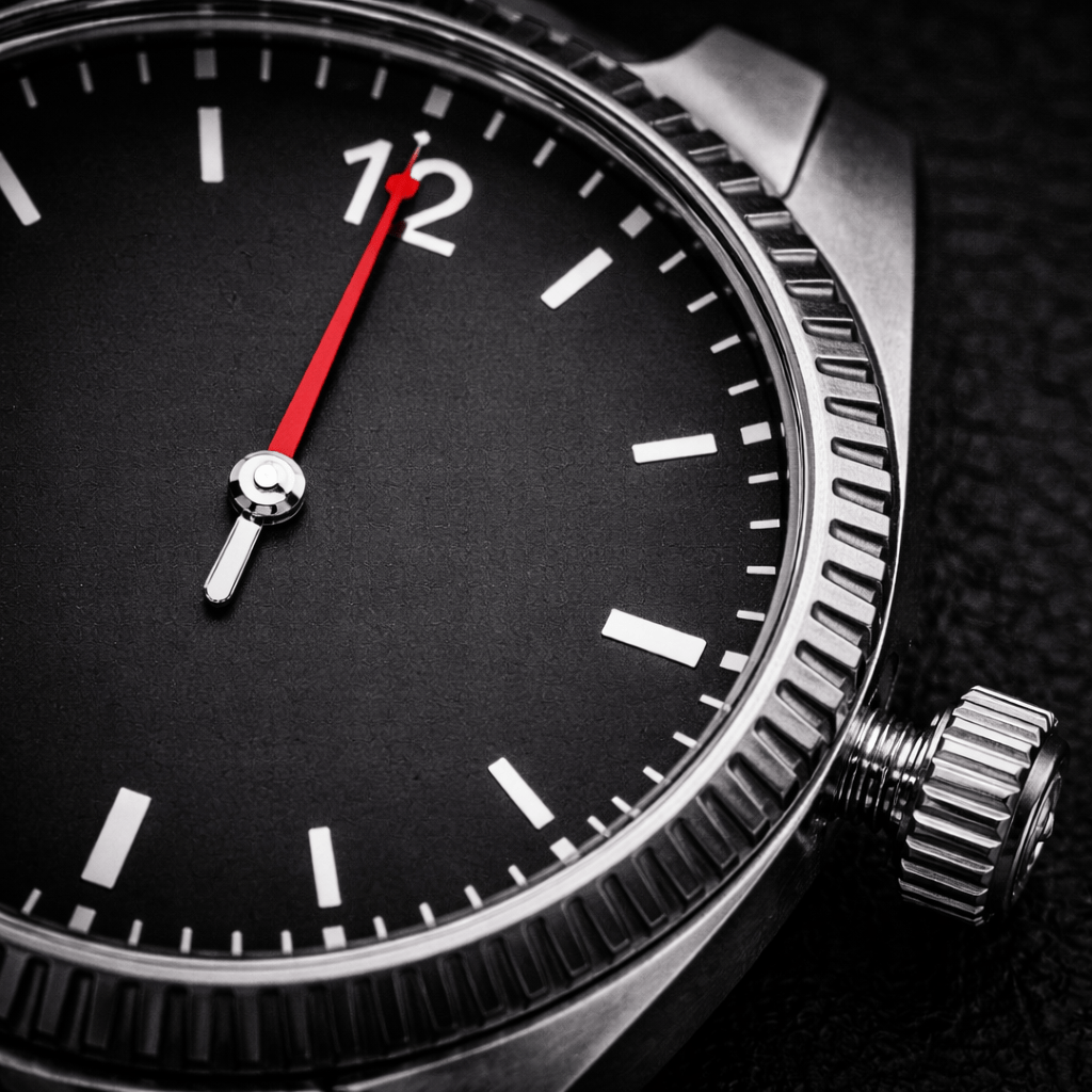
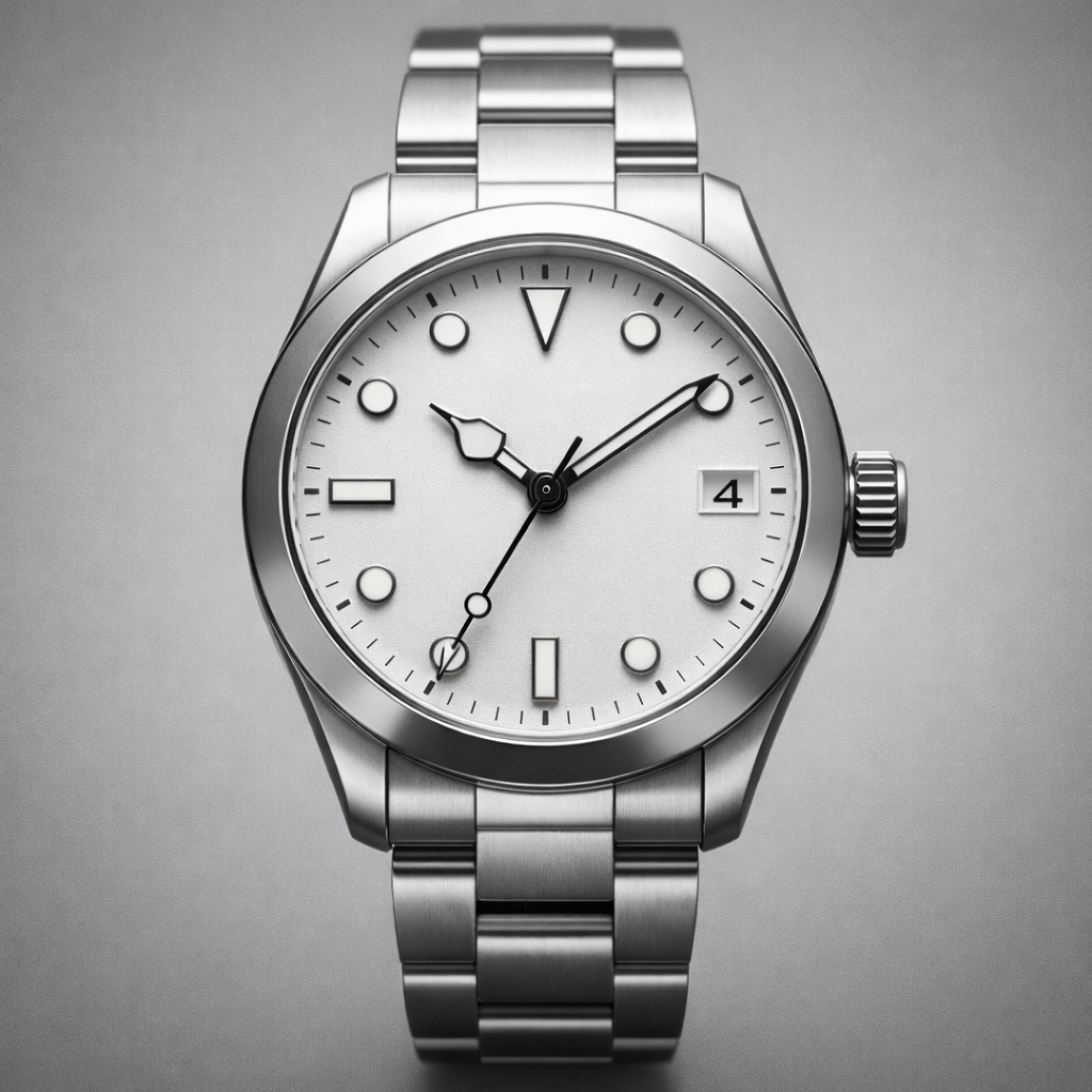
A dial is already busy: hands move across it, hour markers establish rhythm, and the brand mark, date window, subdials, or artwork may also need space. Every added word becomes another visual element the eye must process.
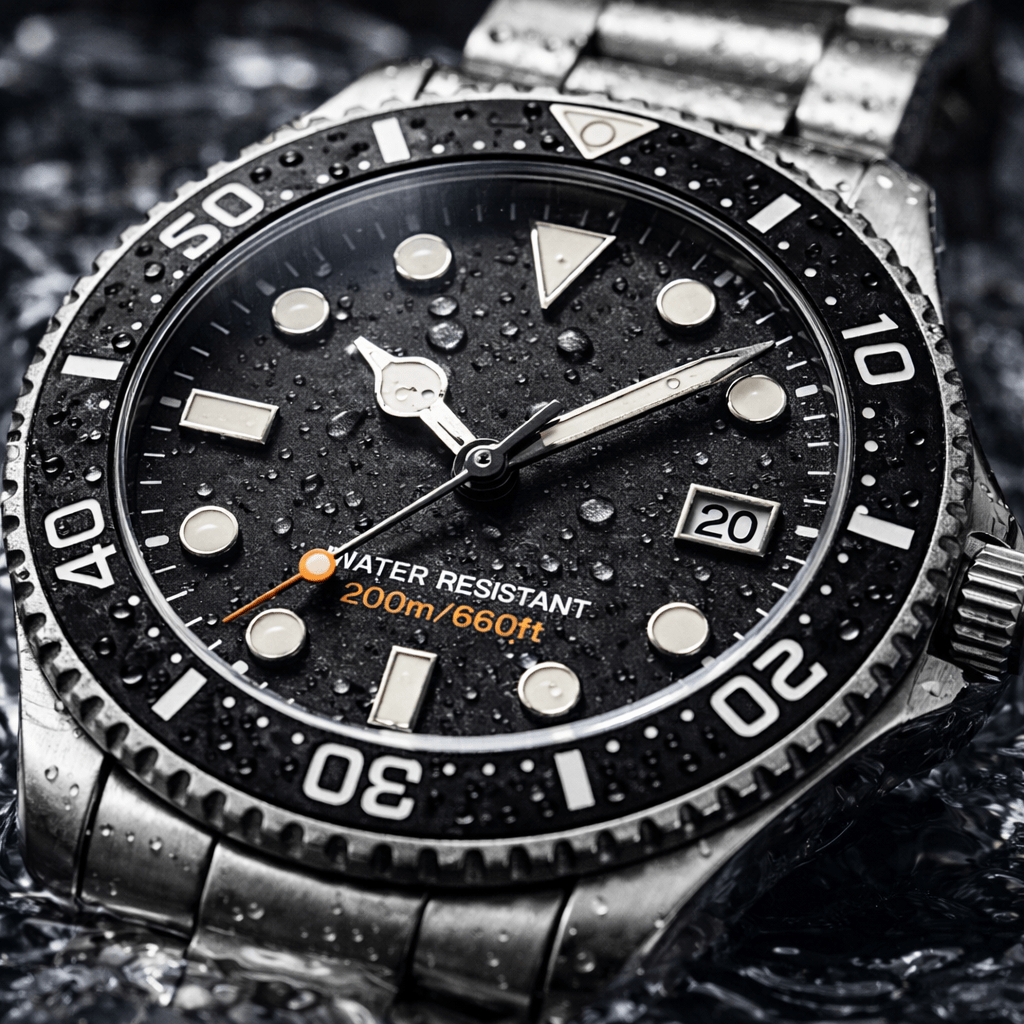
The first challenge is hierarchy. Important lettering needs enough size and contrast to remain readable, while secondary text should stay quieter. If every word is equally bold, the dial loses its focal point.
The second challenge is spacing. Curved text must follow the dial cleanly, letter spacing changes around a circle, and even a small alignment error becomes obvious beside precise hour markers.
Practical check: view the dial at normal wrist distance, then place the hands over 10:10, 3:15, and 6:30. The wording should remain legible without making the time harder to read.
Meaningful text can give a custom watch real character. The lesson is restraint: the words should support the dial, not become louder than the watch.