The metal left visible around enamel is part of the dial design, not just the material underneath it.
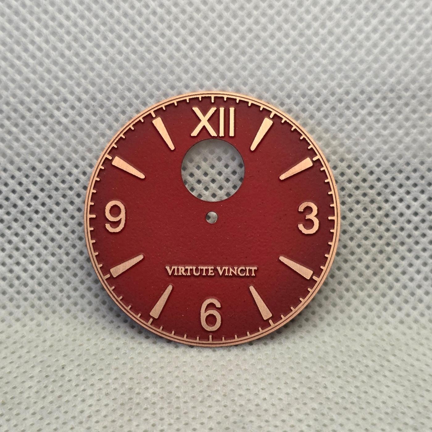
On this Rexx workshop dial, deep red enamel sits beside exposed copper-toned numerals, markers, minute-track details, and the words Virtute Vincit. The warm metal makes those details read differently than they would in bright silver or stark white.
The important distinction is visual. The base metal does not automatically determine the color of an opaque enamel surface. What it does control is the color temperature of the exposed details, the strength of the contrast at each edge, and the way polished or matte areas catch light.
Copper creates a warmer relationship with red. It can make the dial feel deeper and less graphic, while the exposed lines remain readable without looking cold. If the same design used a silver-colored metal, the contrast would feel sharper and more technical.
Watcher Insight: judge an enamel dial as a combination of surface, exposed metal, edge quality, and legibility. The enamel color alone does not explain the finished character.